How I Cut Support Workload by 15%
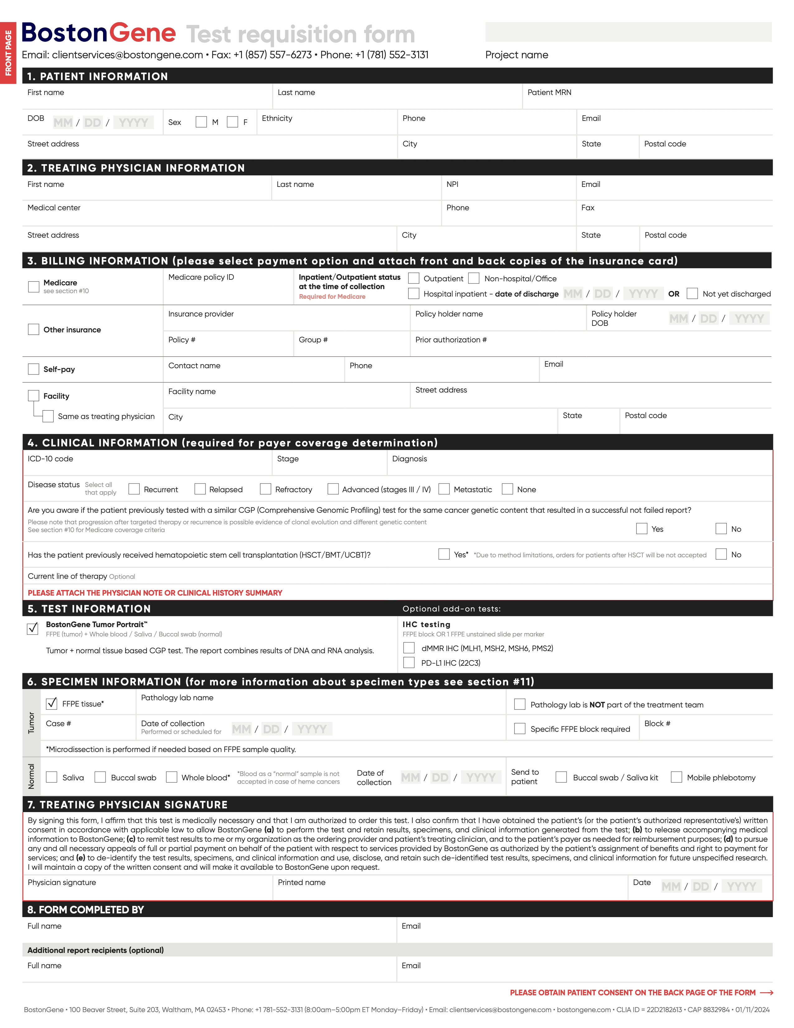
Designing an Online Form Without User Access

Picture this
BostonGene is a health tech startup that provides life-saving genomic tests that help oncologists choose personalized cancer treatments.
Yet, the ordering of these tests was stuck on paper. When I joined the team, I took on the challenge of turning that into a simple digital experience.
These were the results:
15%
2x
4.8/5
The Quest Begins
The goal was to
Migrate users from paper forms to online ordering to reduce support workload

The Hard Part: I had to design for people I couldn't reach
Doctors and their assistants rarely agree to interviews given their packed schedules.
That's why I had to become a detective.
Finding Allies

Sales
knows why doctors choose us

Support
handles every incomplete form

Expert
understands clinical workflows
Through conversations with my colleagues I formed hypotheses about user behavior that would guide every design decision.
Hypothesis
Functionality
Priority*
Result**
Usually users order tests from stationary computers in clinic during work hours
Responsive form, but desktop-first
3*3/1 = 9
Confirmed: <3% of users completed forms on smartphones
Users may not have all necessary patient data available when filling out the form
Allow non-linear field completion
2*2/1 = 4
Confirmed: Users returned to drafts when they had necessary data or time to complete
Clinic work is very intensive and users may get easily distracted
Auto-save and drafts
3*2/2 = 3
Partially confirmed: Most users filled forms in one go, but permission issues sometimes forced them to save drafts
Users are very busy, so form completion should take as little time as possible
Actively use auto-fill, dropdowns with options in fields
3*2/3 = 2
Not confirmed: Users typically copied-pasted data from scanned files
* Priority was calculated using the ICE framework.
** Results show what I learned after the launch.
Behind the Scenes
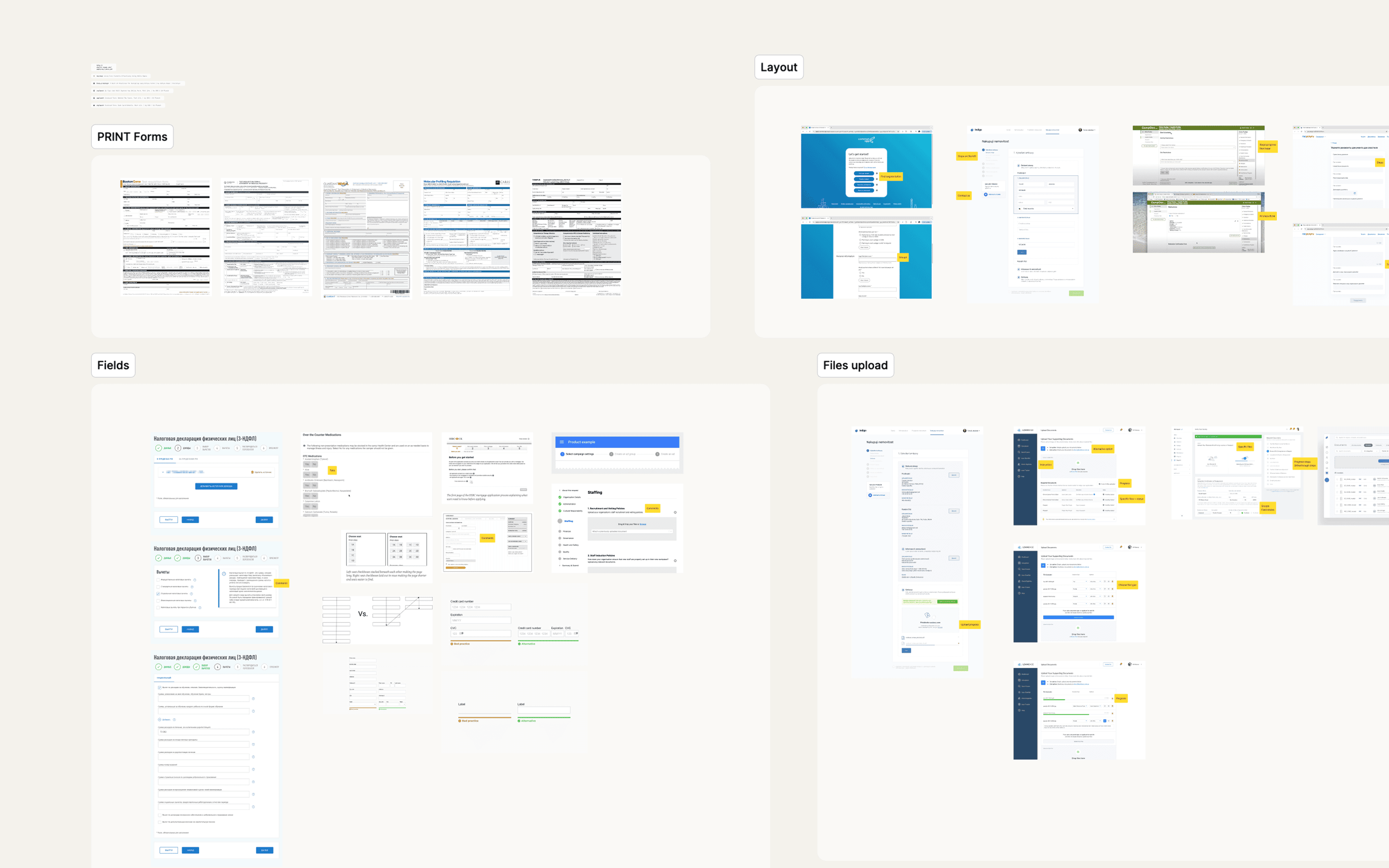
Reviewing references from other domains reinforced the well-known principle: break complex forms into steps and show progress.
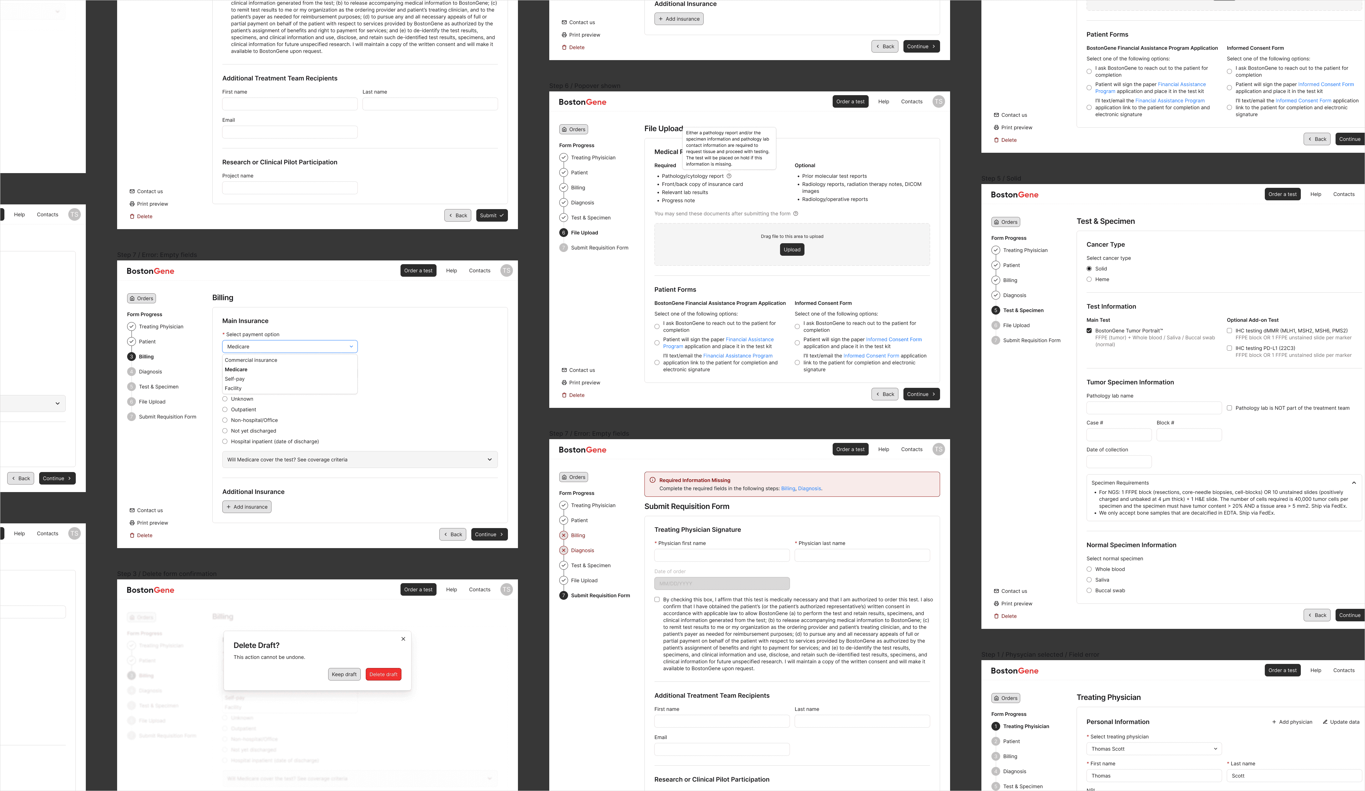
During the wireframing stage I designed a combined navigation: side navigation on desktop collapsing into a compact progress bar on mobile.
This approach kept all steps visible on larger screens while ensuring the navigation stayed usable and space-efficient on smaller devices.
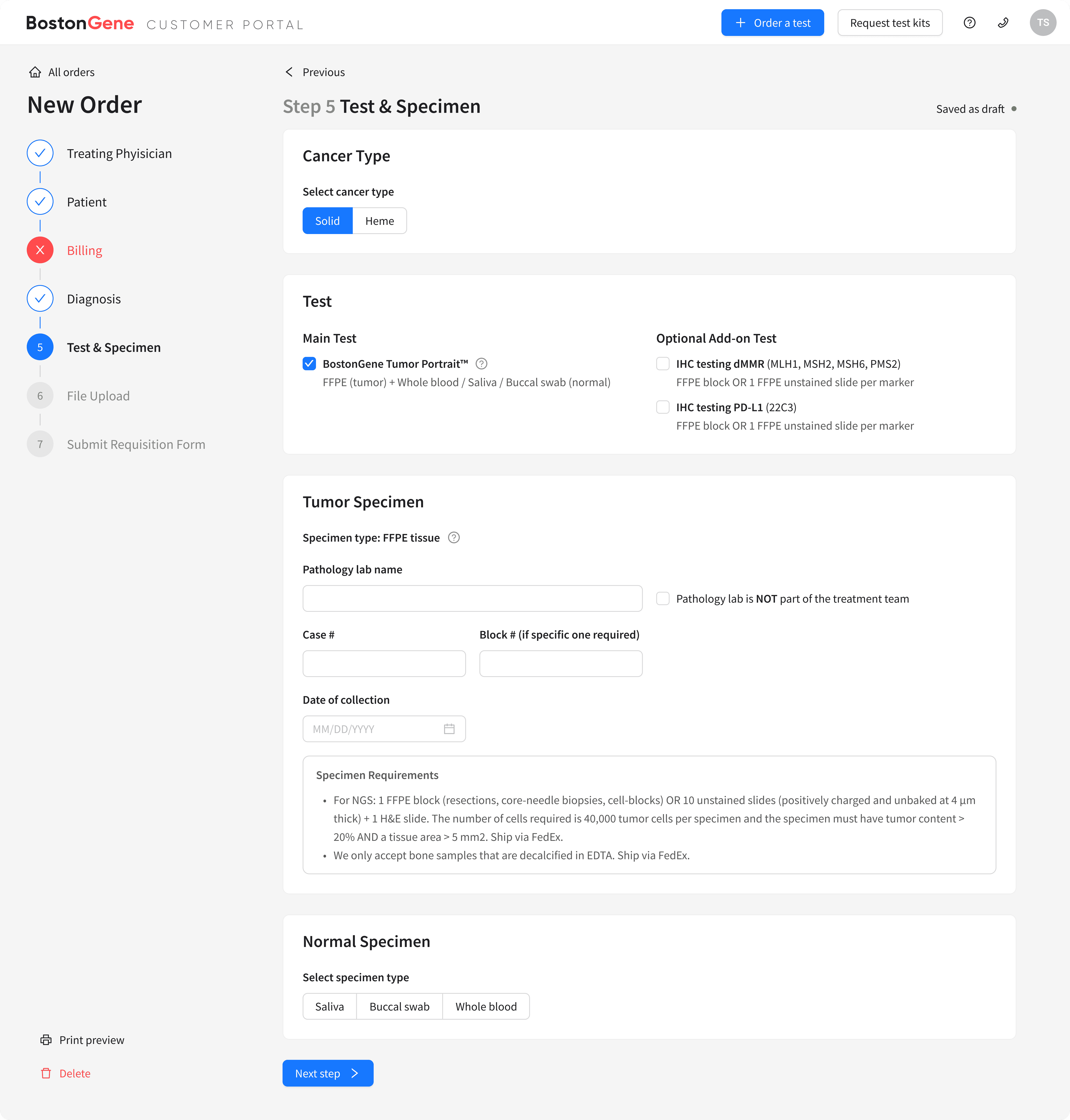
I explored various interactive field types — selects, auto-completes, built-in calendars, etc. — choosing the most suitable input for each form step to cover all use cases.
Unlike the static paper form the interactive version had to collect all necessary data while staying easy to fill out.
Weekly collaborative sessions with my designer colleague, developers and project manager became the backbone of our decision-making process.
I'd present my progress and the team would provide feedback on my solutions. We moved iteratively and always found solutions together.
getting birthday wishes — still working
Discussions with different teams helped me identify various patient scenarios the form needed to handle.
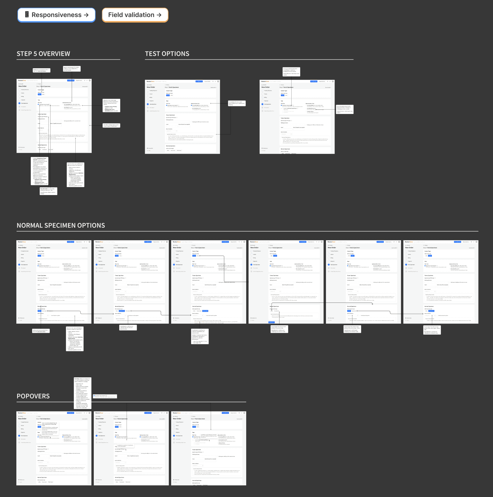
I documented all these decision branches and conditional behaviors in detailed handoff specifications for each step.
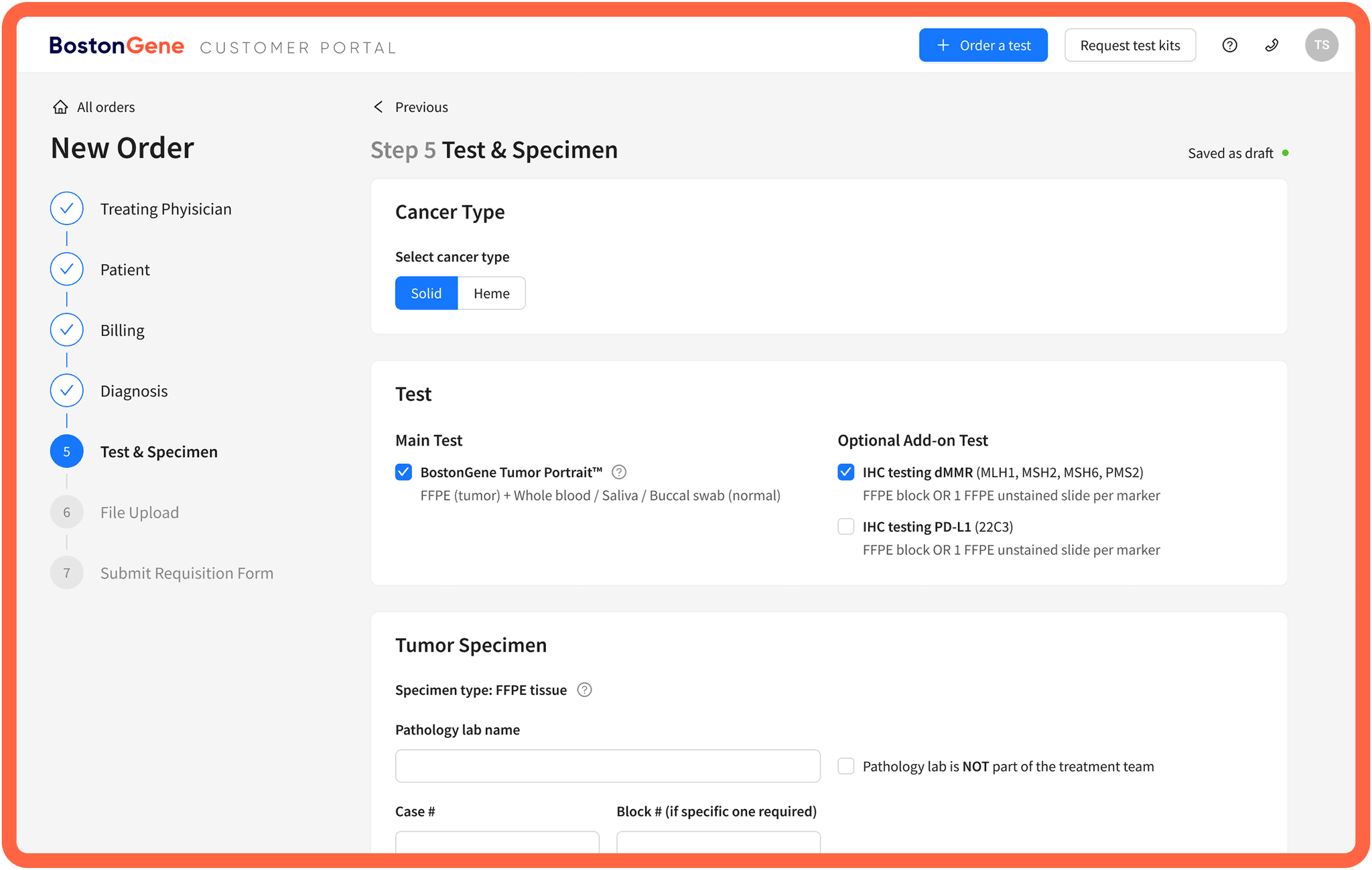
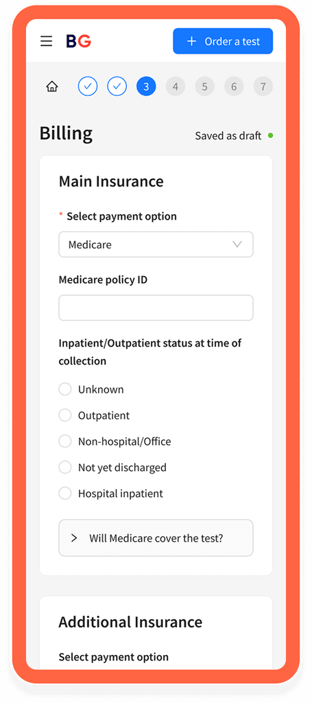
I built the final hand-offs with Ant Design components — chosen because it was already used in other company products.
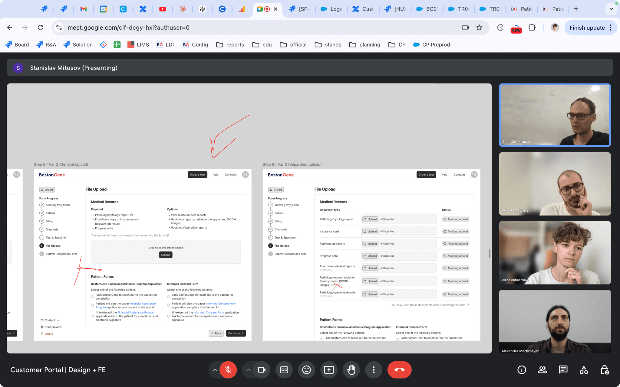
Here's the functionality
?
we built into the form:
Interrogating the Witnesses
Since real doctors were unavailable, I turned to colleagues with clinical experience within our company.
I recreated the real ordering situation: printed patient data (medical records, pathology reports, progress notes) and had testers complete actual orders. Usability testing identified areas for improvement.
Before
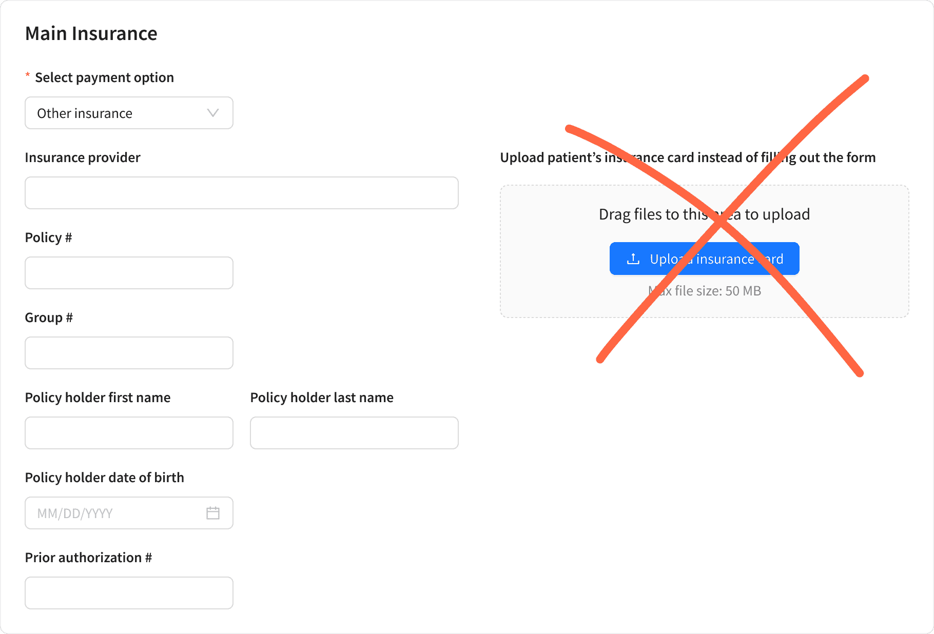
alternative insurance upload confused users
After
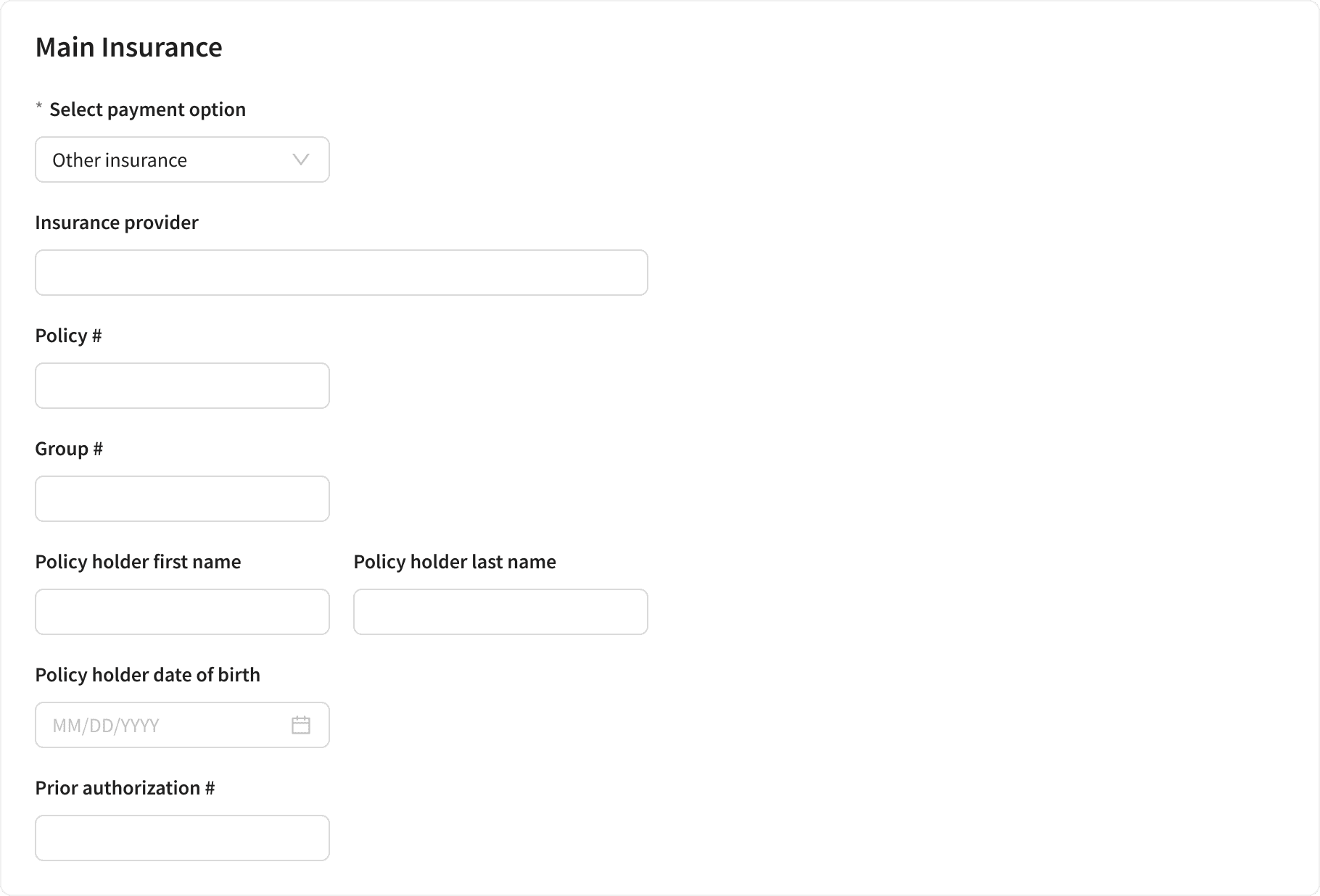
removed it to avoid distractions
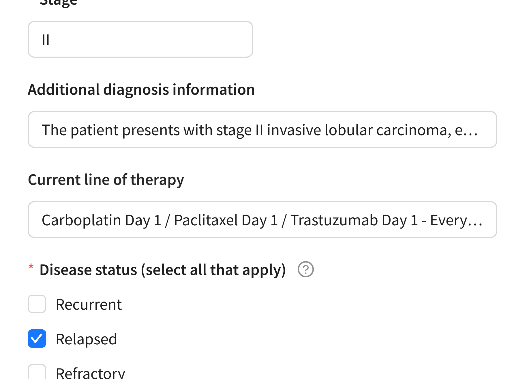
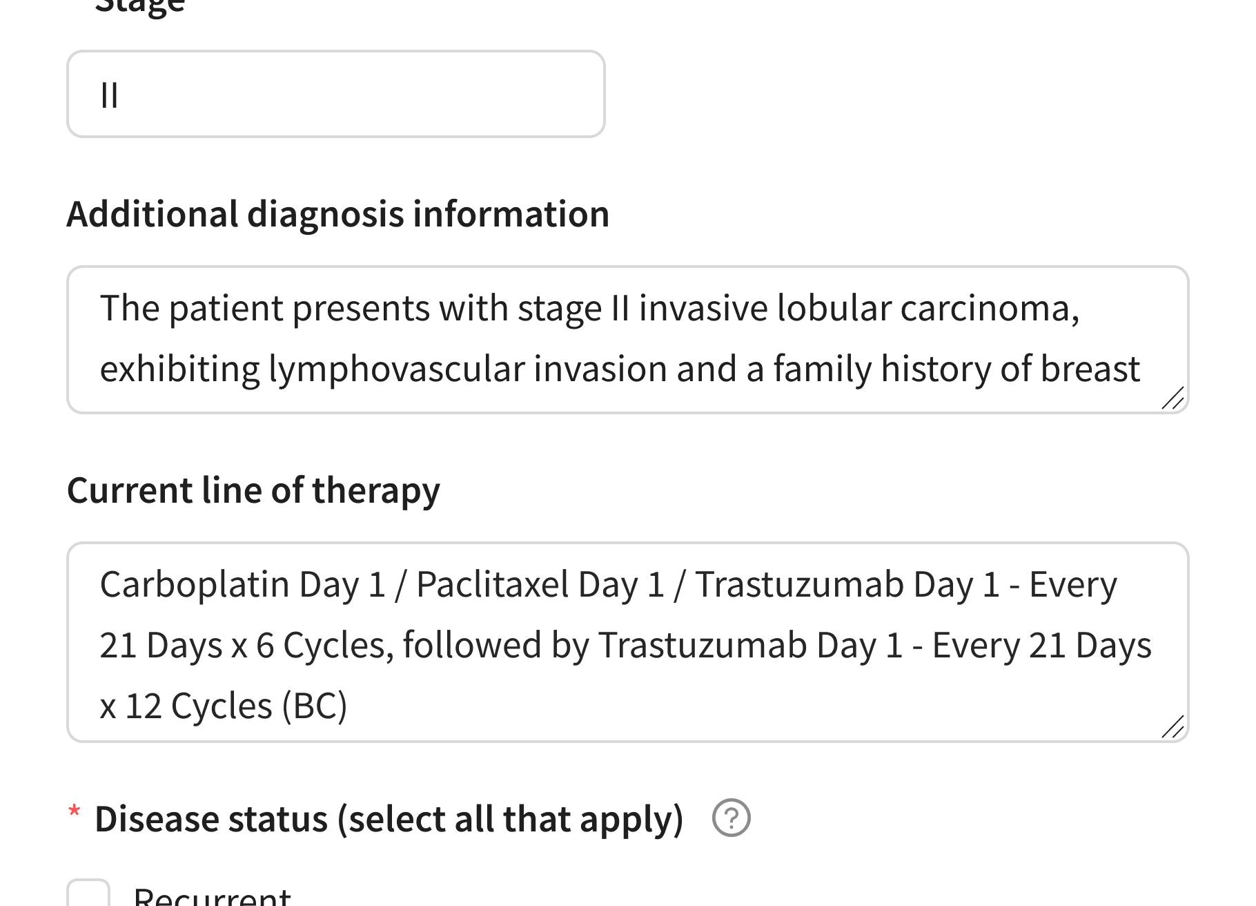
Before
users could add only one diagnosis in a select field
After
replaced with an autocomplete field to allow multiple diagnoses
Final Form
I created an online form that captures all data for medical test processing in under 5 minutes.
User Testimony
Results were encouraging, but I needed real user insights and had to think outside the box to get them.
Method 1: Success Screen Feedback
I added a rating system to the success screen after form completion. Beyond ratings, we received actionable feedback that led to improvements.
Direct feedback from users

Method 2: Real Data Analysis
I analyzed actual input data from completed forms and discovered users were entering very long texts in certain fields. This led to converting standard input to text areas for better usability.
Before
long user inputs didn't fit in standard fields
After
replaced standard input with text areas
*Mock data on screenshots
Method 3: Feedback Channel
I created a feedback pipeline through Account Managers who directly communicate with doctors. This revealed that users were confused by “Required” file upload headers, leading to a simple but impactful microcopy change.
Before
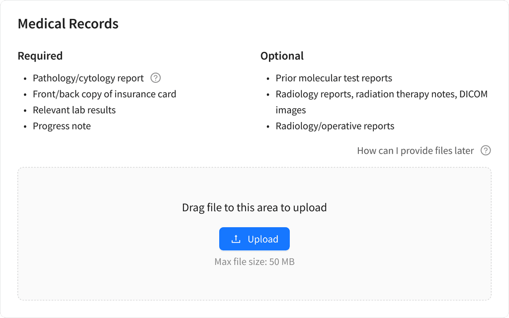
“Required” misled users into thinking uploads were mandatory
After
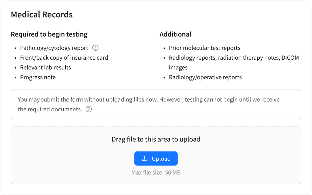
clarified label: “Required to begin testing” and highlighted upload-later option
Sales stopped getting questions like “I can’t upload insurance info — how do I place an order?”
Thanks to the little fix
All this work led to the following results:
15%
2x
4.8/5
What I Had in Mind
The metric I considered most important for the form was completion rate, as it would show where users faced difficulties and where improvements were needed.
To measure completion rate I had planned to:
define the success metric for form completion
build a completion funnel
identify form steps with high drop-off rate
analyze where users face difficulties
This step was planned but not implemented at the time, as the team’s focus shifted to other projects.
My Other Projects
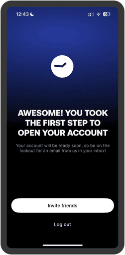
Self-Initiated Case Study: Revolut
I explored Revolut onboarding and proposed UX fixes that cut support workload, prevents mistakes and helps manage user expectations.
mobile app · fintech
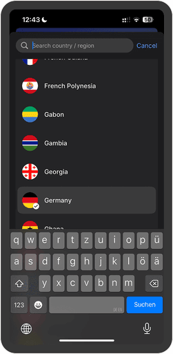
What Happens if You Pick The Wrong Country in Revolut?
My Take on Revolut Account Set up
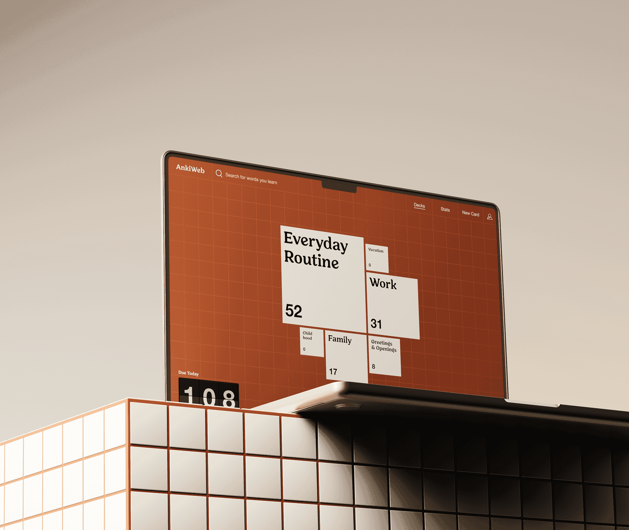
Anki Redesign Concept
Anki is a free and open-source flashcard application that uses spaced repetition and active recall techniques to facilitate learning.